HTML Forms
HTML forms are special kind of HTMLpage that can be used to pass data to a server. Once the server gets the data, it may manipulate the data and send some of it back, or it may store it into a database for later use.
An HTML form will contain input elements like lables, text fields, check boxes, radio-select-buttons, submit buttons, and more. A form can also present lists, from which the user can also present lists, from which the user can make a selection, or a text area where multi-line typing is allowed.
The basic structure of a form is as follows:
|
1 2 3 4 5 6 7 8 9 |
<form> ... input elements ... </form> |
The form tags go inside the <body> tag. The data in the form is sent to the page specified in the form’s action attribute. The file defined in the action attribute usually does something with the received input :
|
1 |
<form name="form_name" action="postSignup.php" method="get"> |
HTML Form Actions & Methods
When you define a form, there are two required attributes: action and method.
The action attribute (action=) indicates the name of the file that the form will be submitted to. The method attributes (method=) specifies how the form will be submitted.
The defined in the action attribute usually does something with the received input, like put it into a database or send back some of the values to the user. Here’s an example of a simple form with action and method attributes.
<form name=”input” action=”form_action.php” method=”post”>
Full Name : <input type=”text” name=”fullname” />
<input type=”submit” value=”Submit”>
</form>
The Input tag
The most common form element is the <input> element, which is used to collect information from the user. An <input> element has several variations, which depend on the type attribute. An <input> element , so you can refer to it later.
In general, the sysntax is :
|
1 |
<input type="type" name="name" /> |
An <input> element can be of type text, checkbox, password, radio button , submit button, and more. The common types are described.
Text Fields
<input type=”text”> defines a one-line input field that a user can enter text into:
|
1 2 3 4 5 6 7 |
<form> <input type="text" name="firstname" /><br /> <input type="text" name="lastname" /> </form> |
Password Field
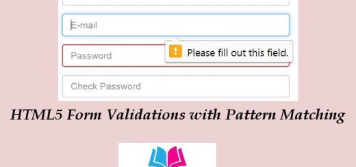
<input type=”password”> defines password field. The password field is just like the text field, except the text that is typed in is not displayed on the screen.
|
1 |
Password: <input type="password" name="userpwd" /> |
Note that a password field doesn’t secure the data, it only hides it on the screen.
Email Field
The <input type="email"> element is used to create an email input field in HTML. It provides built-in validation for email addresses, ensuring that the entered value follows a valid email format. Here’s an example of how to use it:
|
1 |
<input type="email" name="email" placeholder="Enter your email"> |
In the example above, the type attribute is set to “email” to specify that this input field is intended for email addresses. The name attribute is used to identify the input field when submitting a form, and the placeholder attribute provides a hint to the user about the expected input.
Select Dropdown: <select>
The <select> element in HTML is used to create a dropdown list or a selection menu. It allows users to choose one or more options from a list of predefined values. Here’s an example of how to create a basic select dropdown:
|
1 2 3 4 5 |
<select name="fruit"> <option value="apple">Apple</option> <option value="banana">Banana</option> <option value="orange">Orange</option> </select> |
In the example above, we have a <select> element with the name attribute set to “fruit”. Inside the <select> element, we define individual <option> elements. Each <option> represents a selectable choice in the dropdown. The value attribute specifies the value associated with the option, which is sent to the server when the form is submitted. The text content between the opening and closing <option> tags represents the visible text for each option.
To allow users to select multiple options, you can add the multiple attribute to the <select> element:
|
1 2 3 4 5 |
<select name="fruit" multiple> <option value="apple">Apple</option> <option value="banana">Banana</option> <option value="orange">Orange</option> </select> |
With the multiple attribute, users can hold down the Ctrl (Windows) or Command (Mac) key to select multiple options.
File Upload: <input type=”file”>
The <input type="file"> element is used to create a file upload control in HTML. It allows users to select and upload files from their local system to a server. Here’s an example of how to use it:
|
1 2 3 4 |
<form action="/upload" method="POST" enctype="multipart/form-data"> <input type="file" name="fileUpload"> <input type="submit" value="Upload"> </form> |
In the example above, we have a <form> element with the action attribute specifying the server-side endpoint to handle the file upload. The method attribute is set to “POST” to indicate that the form data should be submitted using the HTTP POST method. The enctype attribute is set to “multipart/form-data” to properly handle file uploads.
Within the form, we have an <input type="file"> element with the name attribute set to “fileUpload”. This is the input field that allows users to choose a file from their system.
Number Input: <input type=”number”>
The <input type="number"> element is used to create an input field specifically designed for numeric input in HTML. It provides built-in validation and controls for numeric values. Here’s an example of how to use it:
|
1 |
<input type="number" name="quantity" min="0" max="100" step="1"> |
In the example above, we have an <input type="number"> element with the name attribute set to “quantity”. The min attribute specifies the minimum allowed value, the max attribute specifies the maximum allowed value, and the step attribute defines the increment or decrement step for the numeric input.
By default, the number input field displays up and down arrows that allow users to increment or decrement the value. Users can also manually type a value in the input field. The browser automatically validates that the entered value is a valid number within the specified range.
You can customize the behavior and appearance of the number input field further using additional attributes and CSS. For example, you can add the required attribute to make the field mandatory or use the pattern attribute to enforce a specific numeric format.
|
1 |
<input type="number" name="age" min="18" max="120" step="1" required> |
In the example above, the required attribute is added to make the field mandatory. The min attribute specifies the minimum age value as 18, and the max attribute specifies the maximum age value as 120.
Radio Buttons
<input type=”radio”> defines a radio button. Radio buttons let a user select one (and only one) of a limited number of presented choices :
|
1 2 3 4 5 6 7 8 |
<body> <form> Pick your favorite color :<br /> <input type="radio" name="color" value="red" />Red <br /> <input type="radio" name="color" value="green" />Green <br /> <input type="radio" name="color" value="Blue" />Blue </form> </body> |
Checkboxes
<input type=”checkbox”. defines a checkbox. Checkboxes let a user select ZERO or MORE options of a limited number of choices.
|
1 2 3 4 |
<form> <input type="checkbox" name="vehicle" value="Bike" />I have a bike <br /> <input type="checkbox" name="vehicle" value="Car" />I have a Car <br /> </form> |
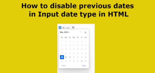
Date Input: <input type=”date”>
The <input type="date"> element is used to create an input field specifically designed for date input in HTML. It provides a date picker or calendar interface to facilitate the selection of dates. Here’s an example of how to use it:
|
1 |
<input type="date" name="birthdate"> |
In the example above, we have an <input type="date"> element with the name attribute set to “birthdate”. This input field allows users to select a date using the browser’s date picker. The selected date value will be in the format “YYYY-MM-DD”.
By default, the appearance and behavior of the date input field are determined by the user’s browser. Some browsers display a calendar icon next to the input field, while others show a built-in date picker when the input field is clicked.
You can add additional attributes to the <input type="date"> element to specify date restrictions or format:
|
1 |
<input type="date" name="eventDate" min="2023-07-01" max="2023-12-31" required> |
In the example above, the min attribute specifies the minimum allowed date value as “2023-07-01”, and the max attribute specifies the maximum allowed date value as “2023-12-31”. The required attribute is added to make the field mandatory.
Submit Button
<input type=”submit”> defines the submit button.
A submit button is used when the user has filled in the form, and is ready to send (“submit”) the data they entered to the server. The data is sent to the page specified in the form’s action attribute.
Reset Button: <input type="reset">
The <input type="reset"> element is used to create a reset button in HTML. When clicked, it resets the form fields to their initial/default values. Here’s an example of how to use it:
|
1 2 3 4 |
<form> <!-- form fields --> <input type="reset" value="Reset"> </form> |
In the example above, we have a <form> element that contains various form fields. The <input type="reset"> element is placed inside the form, and it acts as a reset button. The value attribute specifies the text that will be displayed on the button, in this case, “Reset”.
When the reset button is clicked, it restores the form fields to their original values. It essentially reverts the form back to its initial state, as if it was just loaded.

